θ–S Diagram
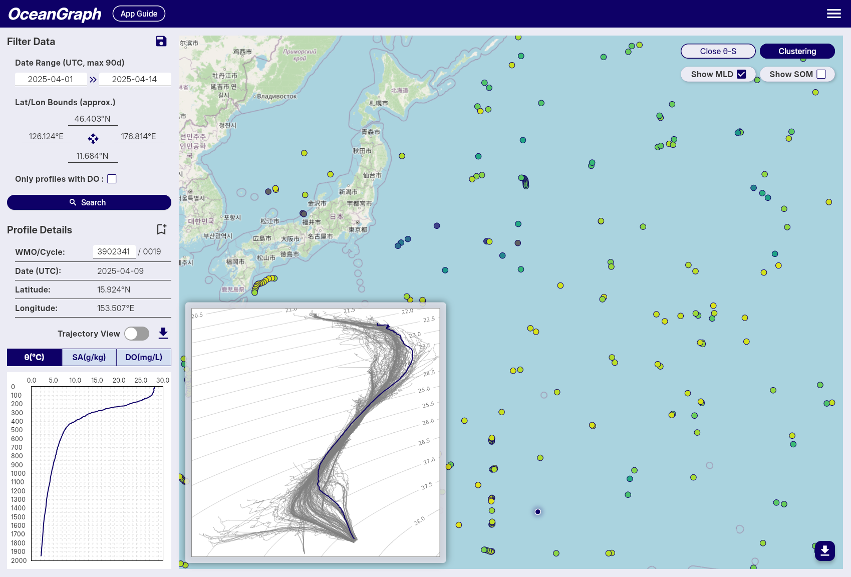
The θ–S diagram compares potential temperature and absolute salinity for either the current search results or one float’s loaded trajectory.
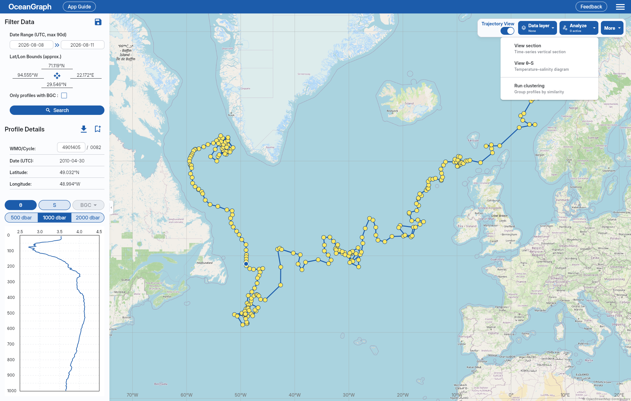
Open the Diagram
The diagram is available to signed-in users.
- With Trajectory off, run a search with no more than 500 profiles. With it on, select a WMO trajectory with no more than 500 cycles.
- Open Analyze in the map command bar and select Generate θ–S. On narrower layouts, open Tools first.
- Select a map marker to highlight that profile, or return to Analyze and select Close θ–S to hide the diagram.
The diagram uses the current search results with Trajectory off or every cycle in the selected WMO trajectory with it on. If a search exceeds 500 profiles, narrow the date range or geographic bounds. A trajectory over 500 cycles remains disabled; OceanGraph does not sample, split, or page either input.
While the diagram is being generated, Analyze shows progress and offers cancel or retry actions. The map remains usable. The latest result can be reopened without regeneration until you reset the search, leave Explore, or sign out.
With Trajectory on, θ–S and View section are independent and can remain visible together. When both are visible, selecting a map marker or using the left and right arrow keys changes the selected cycle in the marker, the section’s dashed line, and the highlighted θ–S profile curve together. Only one analysis job (θ–S, Clustering, or 3D view) can run at a time, but an already displayed θ–S diagram can still be closed while another job runs.
Read the Display
- The vertical axis is potential temperature and the horizontal axis is absolute salinity.
- Background contours show potential density anomaly referenced to 0 dbar (σ0). OceanGraph converts potential temperature to Conservative Temperature internally for this TEOS-10 density calculation; the plotted axes do not change.
- Each profile line uses pressure rows with a finite temperature-salinity pair. Profiles with fewer than two pairs are omitted.
- Unselected profiles use cluster colors, with excluded or unassigned profiles shown in gray. This is independent of the map’s Data layer.
- The selected profile appears in front as a thicker blue line.
Clustering and selection changes update the open diagram automatically.
Use the diagram to compare water-mass structure and mixing patterns. For a conceptual explanation, see T-S Diagrams in Oceanography Explained.